
With 2018 on the doorstep, designers are turning their attention to watch what the New Year will bring in terms of fashions, trends and colours. A colour adds atmosphere to a space, giving it personality and character. So, what do all the big players predict will be big colours for the coming year?
Colour in its Boldest Form
The last few years have been fairly muted in terms of colours and shades, perhaps a reflection of the austere times we have found ourselves in. From barely-there colours to muted greys, they are being left behind with colour coming back and in its boldest form too.
We have scoured online interior design magazines and looked to leading colourists Pantone to see what colours will be making their way into our homes in 2018.
#1 Colourful
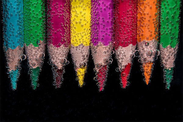
House Beautiful tell us that colour will be bold and strong, saturated and strong, a great way to describe what Pantone is calling ‘Playful’ colour schemes. Don’t think 80s neon, however, as you may have missed the word ‘strong’.

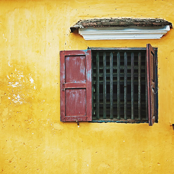
So, if 2018 is the year you opt for yellow, opt for a fun canary yellow or if you want the freshness, mellowness of green, opt for a strong, almost-lime, statement green.
Strong colours work well in all major rooms in the home, but we think the playfulness of these colour scheme would be at its glorious best in the dining room or kitchen/diner.
Don’t overload the space, however. Maintain a muted background with neutral dining furniture and wood dining table, keeping the strong colour to one wall if you are not brave enough for a canary yellow dining room. Use slightly less-strong colours – grey, blue and a toned down green – in accessories to keep an air of frivolity without turning back the clock to Day-Glo 80s neon.
#2 Black is the New Black
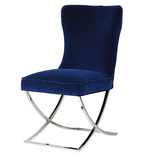
Black is not in the Pantone 2018 palette – but a deep, ‘sailor blue’ is and that’s good enough for us – but some of the top, online interior magazines are naming black as the new black.

And we love it! We never fell out with it, especially not in the living room. We love the dark, matter black moodiness in alcoves or on one wall, offset with copper lamp shades and fittings, as well as copper, brass or gold framed mirrors.
Offset it further with a hint of jazz such as blue armchair, and add a glimmer of understated detail with patterned rugs. Keeps the lights on low and let the candles flicker – what is there not to love about the romantic appeal of black?
We also noted that some magazines were extolling the virtue or black flooring: could matte black laminate or vinyl be the surprise interior design trend for 2018?
#3 Subtle
Canary yellow and matte black may not be your thing and so there is a third option predicted to be big this coming year: the subtle group of colours is what you would expect. Subtle, light and delightful but the surprise colour for us was pink.

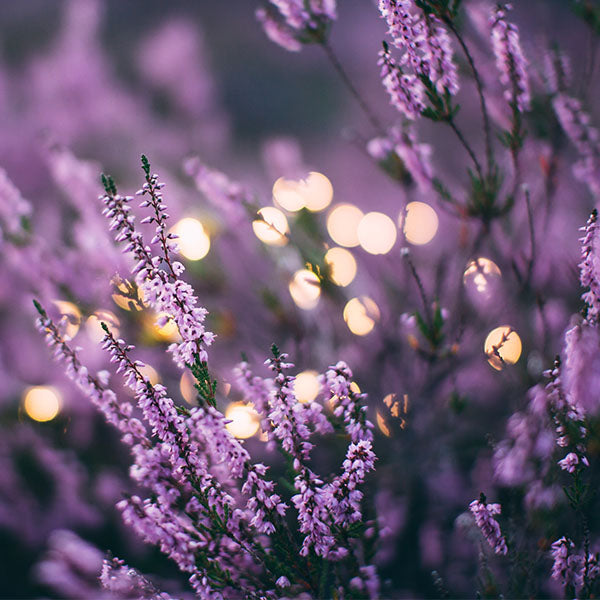
Pantone called it Pink Lavender, a darkish, almost almond pink or there is Almost Mauve if you want no more than a hint of pink. Coconut Milk, Warm Sands and a dove grey Harbour Mist are also being touted by Pantone as a colour scheme, a perfect choice, we think, for the rustic bedroom. Could it be that the ‘seaside’ influence has yet to disappear?
What colour scheme will it be in your home in 2018?