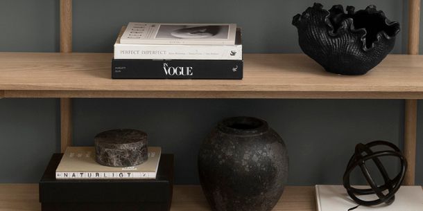
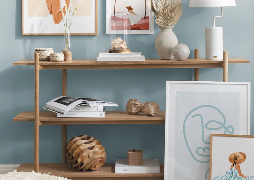
You have a beautiful rustic bookcase, but what do you put on it? The obvious answer is, books, right? Not so fast! There’s a lot more to styling a bookcase than you may initially think. According to the team at Desenio, the Scandi-loving wall art specialist that offers affordable art for stylish interiors, your bookcase is a stage to express your creativity and flaunt your own personal style. Cram it full of books and it will look cluttered and disorganised, but with some clever styling tricks, it can become a wonderful focal point in a room. We asked the experts at Desenio for some ideas on how to transform a bookcase into a well-styled display cabinet showcasing framed prints and accessories, as well as books. See some great tips below.
5 Ways for styling your bookcase
1. Pick your style
To create a display that reflects you, the first thing is to figure out what your design style is. Are you a maximalist or a minimalist? Do you love bright colours or prefer a neutral blend of shades? The good news is there are no rules. The style of prints you choose to arrange on your wooden display cabinet depends on your own personal taste, but if you’re not sure, opting for neutral or monochrome graphic prints or something abstract is a safe bet.
2. Go for frames in various sizes
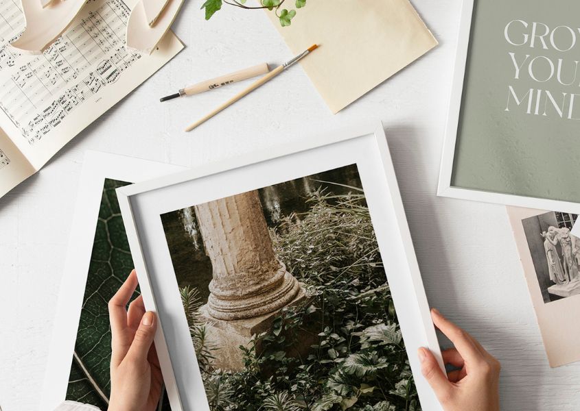
By choosing framed prints in a variety of sizes you can really flex your creative muscles! It’s worth measuring between the shelves to double-check the space, but generally, the majority of bookcases allow for frames sized 40x50cm. To create a stylish display, add in some 30x40cm and 21x30cm frames of prints that work together.
3. Layer-up frames
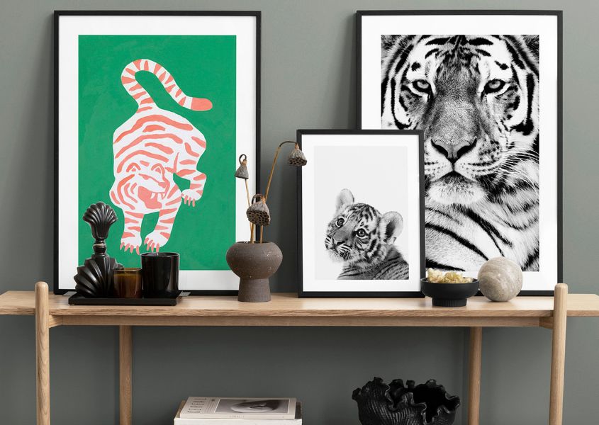
You’ve picked a variety of different-sized frames, now you need to know how best to display them. Framed prints form the backbone of a stylish bookcase, whether that’s a wooden display shelf or industrial style shelving, but you want to avoid them being one-dimensional. The trick here is to layer and overlap them slightly to add intrigue and contrast. Put the tallest frames at the back – if there is a back to the bookcase, lean the frames against it – and the smaller ones in front to create an eye-catching display. Try to avoid using too many or the shelf will look cluttered – three on a standard-sized shelf is usually adequate.
4. Make it personal
When styling your bookcase, it’s important to include personal objects to make it truly work. These could be sentimental objects you have picked up over the years, photos of a memorable holiday or of your loved ones, candles, vases or other treasured ornaments – maybe even your favourite hardback book. If they make you happy every time you look at them, then they’re worth putting up on display.
5. Look at it from a distance
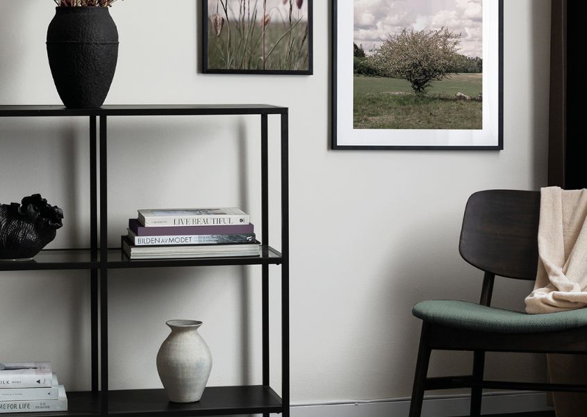
Once you’ve curated your display the best way to admire your efforts is to take a step back and look at it from a distance. Think about the overall balance of your creation taking into account the colours and positioning of the frames and ornaments. The trick to successful styling is finding balance, whether that’s with a bookshelf, coffee table or wooden sideboard. Check if the size, scale and contrast work together. You want to make sure that the objects on display feel balanced without being too symmetrical.
Discover beautiful art for your bookshelf at Desenio and shop our rustic bookcase collection at Modish Living.
All images Desenio.
Read more
For more ideas and home inspiration, explore our Our Friends feature blogs, including tips on how to work with pattern with Prestigious Textiles or ways to bring character to a new build with Instagram influencer @av.home.